In Trend Micro, claiming expense will go through four steps:
1. Expense happened
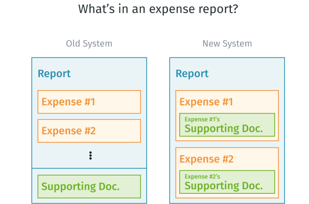
2. Submit expense report with two materials (expense detail & supporting document)
3. Wait for manager(s) and finance to approve
4. Get reimbursement
Under this background, I was asked by PM to find if there were any chances to improve the experience between (1.)expense happened and (2.)expense claimed.
01
Understand Problems
Analyzed history request records and conducted user interviews to find out WHAT the problem is and WHY it is a problem.
⇢ 02
Define Problem and Goal
Collaborate with PM and Devs to define the main problem and our project goal.
⇢ 03
Ideate Solution
Set a hypothesis and develop possible solutions.
⇢ 04
Validate Through Pilot Run
Release MVP to pilot group, collect feedback, and prepare for next iteration.
I first started with the regions that were planned to transfer from the older system to our new system. Therefore, I asked PM to query 2018~2019 Australia and New Zealand's report records from the database for me, looking forward to finding if anything was interesting.
The way I analyzed 2018~2019 Australia and New Zealand's report records were by asking questions first, then digging into the data.

Intending to know the reasons behind these findings, we arranged serval interviews with four salespeople who claimed expenses most often in last year, understanding the details of their claiming experiences.
After the interviews, we discovered the main pain points are:

We consolidated the insights and came up with the journey map to help the team better understand the problem:

From the results of data analysis and user interviews, we found out that applicants like sales or PM often (or in a regular basis) traveling around meeting partners are our main users. When they want to claim the expenses happened during the trip, they often spend lots of time generate and note-down expenses. Because of this, they feel its time-costing or even annoying. Currently, they hand in the hard-copy to Finance or scan/take photos to the receipts, and manually fill in the expense detail. Despite these solutions still cost them lots of time
After some discussion with the team, we came up with this hypothesis:
We believe that after we release a mobile app to Australia and New Zealand Sales team,
Will result in most target users submitting requests through mobile app to reduce the effort of preparing supporting documents.

Considering the release time and technical limitation, we decided to build an All-in-One mobile app “JARVIS app” that includes the mini-app “General Expense”. PM and I went through several process, like site map, wireframe, user flow, to build up the overall UX designs.

After tons of discussions with PM, developers, and stakeholders, I designed the final UI and prototypes of some critical user flows. Here are the final designs:
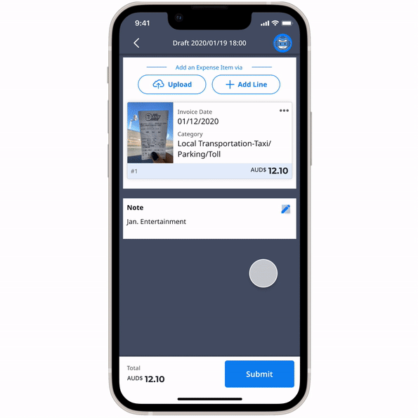
Applicants can upload receipts’ photos, email screenshots, or pdf files for supporting documents via their mobile phone. No more scanner or transfer between mobile and laptop is needed. All these actions will be synced to the system and can be seen on the website.
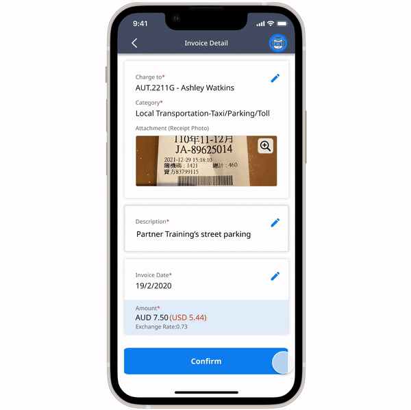
After a photo is uploaded, the system will start smart-scanning (adopting OCR technology) the information on the receipt.
By adopting OCR technology, the system can catch the information, such as invoice date, merchant, the amount on the receipt, and automatically fill in the form. Also, we connected the employee database to help applicants auto-complete the employees’ names.
Because this was the first time applicant saw this function, we added some hints besides the pre-filled fields to ease their confusion.
Applicants can finish the whole expense-claiming process from edit to submit in this app.
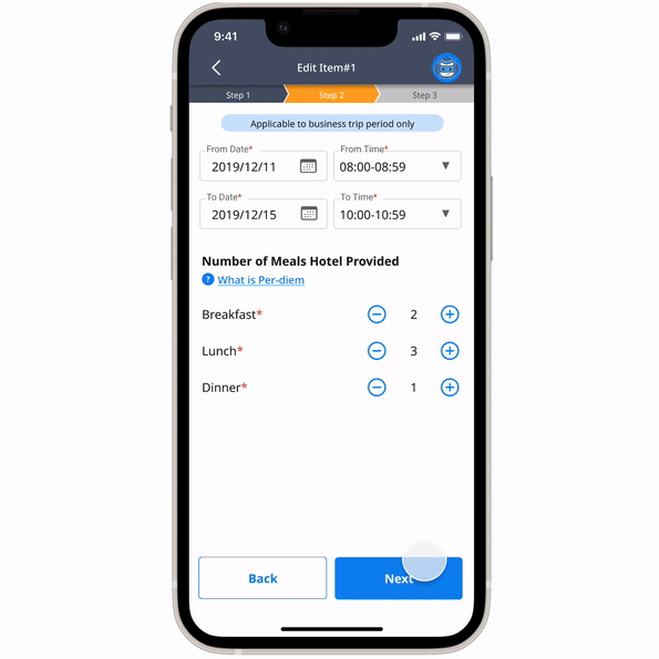
Editing an expense item will proceed with three-step:
Right after these steps, there is an expense overview page for applicants to check the information they enter. After completing editing every expense item, applicants can choose to save it as a draft or submit the request.
After release to the pilot group, we asked them to do a quick survey and interview. The feedback was positive and looking forwards to an upgrade version of more features!

By having a successful result and earning recognition for users, we decided to launch this product in seven countries officially. Gratefully, the official launch approached:

This was my first time responsible for an end-to-end UX/UI design. Everything was challenging and fun.
Due to the size of the organization, innovation inside a big company with many departments was not easy. There were many stakeholders to communicate, explaining to them why we want to make a change, and how it will benefit and affect them. Moreover, this app was built on an existed system, and that existing system was built on an older system. It means that there are various data structure changes to do. Those mentioned above ultimately limited the design.
In the beginning, I was a little frustrated because of the limitations. However, I talked at my colleges and found out:
It's all process and the product will improve little by little in every release.
(Agile Spirit!)
ps: I want to give a big shoutout to the team that helped every step of the way, from ideation through flawless execution.💖
%20-%202.png)